Showing posts with label Information Design. Show all posts

Friday, December 19, 2008

Simplicity is the Essence of "User Value"

Sometimes some gadgets are built so complex that it's hopeless. Take my microwave for example, with 20 buttons and a number pad.

All I need is TWO buttons and a number pad to enter the amount of minutes and seconds I need to heat up my food.

Here is what the manufacturer gave me:


And here is what I really would love to have:

Monday, August 11, 2008

Olympics Observations...

1) Matt Furey is such an excellent writer and opportunity marketer. Whenever there's a momentous event, you can count on it, Matt will fire off a personal and well-written letter on the occasion and will not of course forget to plug in his products as well.

This afternoon I found in my mail box his take on Michael Phelp's second gold medal and the phenomenal 4x100 race with the French. Online marketers: take notice and emulate.

2) A failure in information design: isn't it annoying that NBC will not broadcast maximum scores in any given competition?

For example, NBC anchors will repeatedly tell us that an American athlete just scored 15.87 and that it's an "excellent score." But HOW excellent is that? I have no idea since I do not know what the PERFECT score is.

If perfect score is 16, then I can make that judgment for myself too and agree that it's an "excellent" score indeed. But what if the perfect score is 20, 50, or 100?

It's baffling that NBC continues not to provide the audience what the perfect score is in a competition. If I were them, I'd not only broadcast the perfect score but also include a tiny pie-chart right next to the individual score, visually displaying how close the individual competitor got to achieving that perfect score. That's a piece of must-have information graphics that is sorely missing from NBC broadcasts.

3) Image sacrificed to cuteness. Have you seen the GE commercial that shows an ancient Greek disc thrower bringing down the Parthenon when the wind changes its course? I thought that was a DISASTER of a commercial for GE's Wind Power projects because, although humorous, it plants in the mind of the audience the IMAGE that wind can be a DANGEROUS element leading to DESTRUCTION of PRICELESS TREASURES.

Wow! Whoever thought of that commercial really did an excellent job of planting the seeds of doubt in the minds of those who perhaps already had a question or two about wind power to start with. That was a textbook case of sacrificing function for form.

4) An odd comment in the year 2008. I was taken aback by a casual comment made by one of the NBC commentators, following the fall of an American gymnast during her performance (I am paraphrasing): "...that was like tearing her wedding dress in the aisle..."

I found it very peculiar that the male commentator chose such an image to describe the female gymnast's plight.

Would he describe the foul up as "...like tearing his tuxedo's pants in the aisle..." if the athlete in question were male?

Monday, June 16, 2008

How Not to Design a Squeeze Page

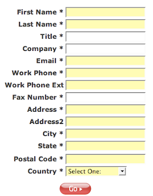
I did not make this one up folks. This one is for real and is an excellent example of how NOT to design a squeeze page, especially one set up to sell a very expensive web-based service.

The rule is -- the more information you ask from your prospective customers upfront, the lower will be your conversion rate.

How many people do you think have signed up for this "Free software demo" by providing all the following MANDATORY information (all the fields with asterisks)?


What were they thinking?

You have to be really desperate for this software in order to provide all that MANDATORY information before allowed to watch the demo.

The kicker is, they won't tell you WHAT exactly their "service" is all about either. No. You have to give them all that information about yourself (including your FAX NUMBER) and THEN, and only then, they will allow you to have a peek at what they've got.

Good luck!

Rule of thumb: if you'd like to have a good conversion rate, ask no more than NAME and EMAIL address. That's it. Some people are so hungry for your e-mail that they even skip the name.

P.S. The cost of this service that you cannot even sample before giving up all that information is $5,000 upfront for "set up"; and then $300 recurring fee every month. So I guess they are interested only in people with really a lot of cash and a lot information to give up. I hope that strategy is working for them.

Sunday, May 4, 2008

Human factor -- still important


In this day and age of mega-total-automation we tend to forget the human labor that goes into every word, every package of meaningful information.

Here is a video title from CNN Fortune website.

An accident that really happened because someone was too tired to type "An accident" correctly.

The idea is not to nitpick on human frailties but to call attention to the continuing importance of quality labor and human expertise which will be important even in the year 4008.

You can automate quality up to a certain point. But after that, there'll always be a need for well-trained people who do their jobs well.

Thursday, April 24, 2008

Heparin: Bad Product Design is a Public Threat

I keep saying this for years and some people think I’m exaggerating: “Bad information and product design can main and even kill.”

Here is an amazing recent example of how badly-designed products can cause needless injuries and pain, as it happened to movie star Dennis Quaid and his wife who almost lost their newborn baby when an abnormally high dose of Heparin (a blood coagulant) was given to the poor infant.

I’m not referring to the claim that Chinese-made Heparin bottles contain contaminants.

I’m referring to the lunatic label design that, in the hectic conditions of an emergency ward, makes applying 10,000 units of Heparin instead of just 10 a very simple mistake to commit.

Just look at these bottles…

The one on the right is 10 units and the one on the left is 10,000 units!

Same size bottle. With almost same shade of blue label! Perfectly designed to commit a 1,000-fold error...

Is it a wonder that many nurses ended up injecting the wrong doze and thus inadvertently endangering lives?

Who can blame them when a critical product has this kind of totally unacceptable label design? I don’t.

To its credit, the company that manufactures Heparin has changed the packaging of these two different dozes. I understand now one of the bottles has a bright RED label. Duh!

Whoever designed these unbelievably-close blue labels should be fired and never allowed to design anything again. Period.

Friday, February 29, 2008

On the Internet, All is Global

Sometimes web designers get caught up in the illusion that they are building just a tiny little "local" web site, or that their employer is such a "well known" entity that "everybody" knows what their acronym stands for.

Mega illusion.

No matter how "local" your business is, if it's a public site, remember this: it takes the same amount of clicks ("one") to reach it from Mongolia as from Michigan.

So design it as though your visitor would be a total stranger. Otherwise you can frustrate even your local visitors.

Example 1:

I forgot the number of local newspaper or TV station sites which do not even bother to mention the STATE in which they are located!

For many times in the past I read a story I liked in a local publication. I then wanted to give full reference to the story but all I'd see on the page would be "Springfield Herald" (for example" or "Rockville News" etc.

But WHICH Springfield or WHICH Rockville?

If you spend a few minutes clicking on 3, 4 or 5 pages in a row, you eventually find the state but you end up asking yourself "why?"

Why does a local publication be so oblivious to the fact that people NOT from your neck of the woods might be visiting your site as well?

Why alienate them since you never know who will click and honor your advertisers?

Example 2:


Again the issue of acronyms... Some large organizations get so complacent that they simply forget to write the open form of their well-known acronyms.

AARP is a case in point.

I challenge you to visit www.aarp.org and find out what "AARP" exactly means!

If you find it let me know and I'd be happy to note it down. But if you can't, don't feel too bad because I've already spent 15 minutes to find it with no success.

I'm of course 99% sure that AARP stands for "American Association of Retired People" but why turn it into a mystery game and a puzzle?

Why frustrate the visitors who might not be too familiar with your acronym?

GOLDEN RULE: help your visitors easily find the MOST OBVIOUS INFORMATION about your company or organization like your full address, or the full name of your organization.

Frustrated visitors do not make profitable customers or members. They do not come back either.

Sunday, July 1, 2007

Bad "Information Design" Leads to Medication Errors

Why are there so many medication errors in the nation's hospitals?

The American Nurses Association (ANA) researched that question and came up with interesting answers.

It turns out such "information design" related mistakes like mislabeled medication or poor hand writing contribute to such errors more than we thought.

The survey of 1,039 nurses across America revealed the following factors responsible for injection-related medication errors:

1) Too rushed or busy environment (78 percent).
2) Poor or illegible handwriting (68 percent).
3) Missed or mistaken physician's orders (62 percent).
4) Similar drug names or medication appearance (56 percent).

5) Working with too many medications (60 percent).

Items 2, 3 and 4 can certainly be avoided by a more careful and user-friendly "information design" program.

As I always say: good information design is not a luxury but a vital necessity. Not only poor information design leads to inefficient and unhappy lives, but sometimes people lose their lives altogether because of it.

For more on this study, please click here.