Showing posts with label Copywriting. Show all posts

Friday, September 5, 2008

3 Universal Rules of Good Writing

There are so many different types of writing that it’s futile trying to list them all.

Yet, there are some principles that hold true in almost every writing situation. I’m tempted to call them “Universal Rules” of good writing, in ANY language.

Here are three such rules:

Brevity. If you can express an idea in one word, do NOT use two words. Shorter is always better unless you’re writing a poem or involved in some aesthetic experiment.

For example, “I did go there” is always better than “as a matter of fact, I did go there”. Eliminate the deadwood and allow your text to breathe comfortably.

Modularity. Break down long procedural descriptions into easily digestible short steps.

Chop your long paragraphs into shorter ones.

If writing for the web, don’t be timid to post each sentence on its own line, with white space in between individual sentences.

Headers. Break up your text with bold headers and sub-headers since most people will only skim through the headers.

Headers that contain the gist of the paragraph below increase comprehension and retention.

For example, here is a good one: “How G-30 suntan lotion reduces skin cancer rate”.

And here is a not-so-good header preceding the same hypothetical paragraph: “Suntan Lotion, Sun, and Your Life”.

Thursday, August 14, 2008

This Clever Catalog Copy Rolls...

I love Crate&Barrel catalogs. I think they are among the best written consumer product catalogs, anywhere.

Here is an example:

"Kik-Step Stools - Kick it and it rolls. Step on it and it locks. Clever spring-mounted retractable casters take this handy steel stool wherever you need it..."

ACTION verbs in the IMPERATIVE mode -- kick it, step on it... it tells you exactly what you should be doing. Nothing is left to chance here.

It addresses YOU - "wherever you need it..."

You hear the music? "Kick it and it rolls. Step on it and it locks."

Just when you're wondering if this thing that OBEYS your commands is actually ALIVE, the writer anticipates your subliminal question -- "CLEVER spring-mounted retractable casters..."

Ladies and gentlemen: this thing is not a dumb stool. It's a CLEVER stool. It will obey you and make you HAPPY. It's an obedient puppy in the shape of a stool.

See how deep good copy penetrates? If the writer who wrote this copy is giving a workshop, take it.

Monday, August 11, 2008

Olympics Observations...

1) Matt Furey is such an excellent writer and opportunity marketer. Whenever there's a momentous event, you can count on it, Matt will fire off a personal and well-written letter on the occasion and will not of course forget to plug in his products as well.

This afternoon I found in my mail box his take on Michael Phelp's second gold medal and the phenomenal 4x100 race with the French. Online marketers: take notice and emulate.

2) A failure in information design: isn't it annoying that NBC will not broadcast maximum scores in any given competition?

For example, NBC anchors will repeatedly tell us that an American athlete just scored 15.87 and that it's an "excellent score." But HOW excellent is that? I have no idea since I do not know what the PERFECT score is.

If perfect score is 16, then I can make that judgment for myself too and agree that it's an "excellent" score indeed. But what if the perfect score is 20, 50, or 100?

It's baffling that NBC continues not to provide the audience what the perfect score is in a competition. If I were them, I'd not only broadcast the perfect score but also include a tiny pie-chart right next to the individual score, visually displaying how close the individual competitor got to achieving that perfect score. That's a piece of must-have information graphics that is sorely missing from NBC broadcasts.

3) Image sacrificed to cuteness. Have you seen the GE commercial that shows an ancient Greek disc thrower bringing down the Parthenon when the wind changes its course? I thought that was a DISASTER of a commercial for GE's Wind Power projects because, although humorous, it plants in the mind of the audience the IMAGE that wind can be a DANGEROUS element leading to DESTRUCTION of PRICELESS TREASURES.

Wow! Whoever thought of that commercial really did an excellent job of planting the seeds of doubt in the minds of those who perhaps already had a question or two about wind power to start with. That was a textbook case of sacrificing function for form.

4) An odd comment in the year 2008. I was taken aback by a casual comment made by one of the NBC commentators, following the fall of an American gymnast during her performance (I am paraphrasing): "...that was like tearing her wedding dress in the aisle..."

I found it very peculiar that the male commentator chose such an image to describe the female gymnast's plight.

Would he describe the foul up as "...like tearing his tuxedo's pants in the aisle..." if the athlete in question were male?

Thursday, August 7, 2008

Great Headlines

"Boat Industry Takes on Water"

~ Business Gazette, August 1, 2008

"In Women's Soccer, U.S. Finds It Can't Kick the World Around Anymore"

~ Wall Street Journal, August 7, 2008

Saturday, July 19, 2008

A Great Opening Paragraph

"WHEN T. S. Eliot said that it is the journey, not the arrival, that matters, he surely was not thinking of a journey to Paris on a commercial airline, at a cost of $1,400, following a two-hour wait on the tarmac, in which cocktails on overseas flights are no longer free."

http://www.nytimes.com/2008/07/20/fashion/20bummer.html

It turns a well-known line by a famous poet on its head while immediately focusing our attention on a current and urgent topic -- the high cost of travel. It's tastefully disrespectful of authority, witty and pertinent. Wastes no time to get to the heart of the issue.

Tuesday, June 17, 2008

Wednesday, June 11, 2008

"Energizing"

Some of the worst excesses of copy writing give the trade a bad name.

Take the following lonely adjective I noticed printed on the label of a bottle of shampoo:

"Energizing..."

Now what the heck does that mean, really?

Energizing WHAT? Does it mean I'll have more energy when I use that shampoo? Of course not.

How much more energy we're talking about? Are we talking in terms of Calories?

Etc. Etc.

Total nonsense and yet someone was paid to write that, and another to place it on the label.

When I see empty rhetoric like that masquerading for good writing, I feel like breaking my keyboard and selling used cars for a living.

Tuesday, June 10, 2008

MEGA MILLIONS - "Learn from History" ???


(Click the image to enlarge it.)

That's the first sentence that greets you when you visit the "Recent Drawings" page of MEGA MILLIONS LOTTERY.

LEARN FROM HISTORY? If we could do that, that would mean the lottery drawings are NOT random!

The whole point to a lottery is that all drawings are (supposed to be) RANDOM and INDEPENDENT from each other.

For anything to have a HISTORY it has to have events that are NON-RANDOM and NON-INDEPENDENT.

I'm really surprised that the Mega Million lottery officials are suggesting that we can "learn" anything from studying the "history" of these drawings.

What do they exactly mean by that, I'm really at a lost.

For a perfectly random and FAIR drawing, we should NOT be able to learn anything by studying the "history" of past drawings.

Do the lottery officials know something that we don't?

Or is it a case of a careless copy writer who has not taken probability at college and who does not know what an "independent event" means?

They need to hire a good technical writer, right away.

Thursday, May 1, 2008

AFI CENTER Can Use a Better Subtitle


Some titles can be correct bur imbalanced if they are constructed in an unparallel fashion.

Here is a good example: the subtitle of the splendid AFI CENTER in Silver Spring, Maryland.

This is a great movie theater and a cultural center; one of the best I've seen anywhere.

But look at its official subtitle:

"Theater and Cultural Center" !?

"[NOUN] + [ADJECTIVE] CENTER"

There are two BETTER and more balanced alternatives:

Theater and Culture Center [NOUN + NOUN]

or

Theatrical and Cultural Center [ADJECTIVE + ADJECTIVE]

Obviously, the second one is a bit funny since a BUILDING cannot "act theatrical" or "be theatrical" as an inanimate object.

So the correct copy solution here would be:

THEATER AND CULTURE CENTER

But that's all right. 99% of people will not notice the imbalance anyways.

Tuesday, April 22, 2008

Perfect Copy Fuses Function with Benefit

Perfect copy that I saw today on the side of a mobile document-shredding truck:

"Cut identity theft!"

The verb CUT here is both function and benefit.

Function: this truck physically cuts (shreds) documents that carry information about your business secrets or identity.

Benefit: it therefore cuts (diminishes) the possibility of a stranger reading your documents and stealing your identity.

My score: 10 out of 10!

Tuesday, April 15, 2008

A Road Kill on the Linguistic Highway

I just saw this copy on the side of a supply truck that belonged to Hair Cuttery:

"change your hair, change in your wallet"

Ouccchhh!

This could easily go into the textbooks as a perfect example of how to write BAD copy.

It is an excellent example of UNPARALLEL STRUCTURE.

If you start one clause with a VERB ("to change"), continue also with a verb in the second clause and do not shift to a NOUN ("change in your wallet").

Every time I see such crooked copy it's like getting punched in the face.

What was wrong with this, I wonder:

"change in your hair, change in your wallet"

Friday, March 7, 2008

Great Movie Review Copy

What an opener for a movie review:

TITLE: '10,000 B.C.': Time Bomb, By Kurt Loder

SUB-TITLE: The Stone Age itself may have had better movies than this.

The new Roland Emmerich movie "10,000 B.C." can be recommended to those who have (1) never seen Mel Gibson's vastly superior "Apocalypto"; (2) never seen the matchless "Lord of the Rings" pictures; or (3) never seen a movie before in their lives. To call the film derivative would be to over-praise it.

Tuesday, January 15, 2008

Watch Your Personal Pronouns

Me, Myself and I
By COLLIN LEVY
The Wall Street Journal
January 14, 2008; Page A13

After months of presidential primary debates, town-hall meetings and cable talkathons, I hate myself. And I mean that in the most old-fashioned way.

For all the rhetorical flourish on display, many of the presidential candidates still don't have a grip on the King's English. That great American personal pronoun, the first person singular, which adorns nearly every sentence of candidate discourse, is still too slippery for many of this year's White House aspirants.

Speaking on Social Security, Democrat hopeful Barack Obama boasted that "here's an area where John (Edwards) and myself were actually quite specific." A few minutes later, Bill Richardson wondered, "What is wrong with having been like myself -- 14 years in the Congress, two Cabinet positions?"

Campaigning is certainly exhausting in a primary homestretch, which may explain this gem from Mitt Romney: "It is going to take a person who is himself an innovator like myself who has the experience to bring change to Washington." Republican contender Ron Paul noted proudly that "We have a lot of similarities . . . Barack Obama and myself, because our campaigns are made up of young people."

The new verbal tic is part trend and part defensive posture. Since the Me Generation, "I" and "me" have become increasingly tangled up as Americans have looked for ways around tricky constructions. As sportswriter Red Smith once put it, "Myself is the foxhole of ignorance, where cowards take refuge, because they were taught that me is vulgar and I is egotistical." In the same spirit, "myself" has become the campaign's de rigueur grammar cop-out, substituted for I or me when the candidate isn't sure which is accurate -- or worse, assumes Americans will see proper English as elitist.

Yet grammar still matters to a lot of Americans. Potential employers often report they are put off by job applicants who display bad spelling or grammar -- taking it as a sign of sloppiness, inattention to detail or lack of IQ. Why shouldn't voters hold the next leader of the free world to similar standards? Especially since, as Richard Lederer, former usage editor of the Random House Dictionary points out, when candidates "chicken out and use 'myself'" in place of I or me, "it shows an inability to take a stand" -- and isn't that something voters should care about?

The stakes are high, and the wrong pronoun can even change the meaning of a sentence. In his New Hampshire victory speech after the New Hampshire primary, John McCain told a cheering crowd, "Enjoy this. You have earned it more than me." (When he presumably meant, you have earned it more than I have.)

The misuse of "I" took its own toll on Bill Clinton in 1992. Running against then incumbent President George H. W. Bush, Gov. Clinton famously said: "If you want a spring in your step and a song in your heart, give Al Gore and I a chance to bring America back." The mistake spawned a pretty good media lashing, as it should have. New York Times columnist William Safire wrote in his language column, "Between you and me -- never you and I . . . the best answer is 'Give I a break.'"

By the time the 1996 debates came around, the president learned his lesson and dumbed it down. At the podium, Mr. Clinton remarked on the "big differences between Sen. Dole and myself."

Not that the 2008 candidates can't find support from the more flexible sort of grammarian for their innovative usage of "myself." One school of lexicographer holds that proper English is however people use it. So, though the classically-approved usage of "myself" is as an intensive ("I myself feel that way") or reflexive ("I hurt myself"), several dictionaries approve its "informal use" as an all-purpose substitute for "I" or "me." What's next, ketchup on hot dogs?

Defenders of heterodoxy say the casual usage has been around for centuries, finding mention in dusty old texts of Chaucer and other reputable English and American writers. But its growing use is intensely controversial among grammarians. "People who are shaky in their grammar think of "myself" as a safe usage," says Bryan Garner, former editor of Oxford's Dictionary of Modern American Usage, "but to a real snoot, it's bothersome."

To handle the skirmish, dictionaries now include tortured "Usage notes" on the casual version. The 2006 American Heritage Dictionary, referring to its in-house advisers, points out that "a large majority of the Usage Panel disapproves of the use of -self pronouns when they do not refer to the subject of the sentence."

One imagines a lot of furniture being broken up by American Heritage's more liberal experts. The dictionary goes on to say, "Seventy-three percent (of panel members) reject the sentence 'He was an enthusiastic fisherman like myself.'" The Panel is even less tolerant of compound usages. Eighty-eight percent find this sentence unacceptable: 'The boss asked John and myself to give a brief presentation.'"

Ahem, candidates.

Despite the excessive presence of "myself" in the current race, its emergence in political campaigning is not recent. John F. Kennedy used "myself" awkwardly once in his debate with Richard Nixon on Oct. 7, 1960, remarking on "the issue between Mr. Nixon and myself." Jimmy Carter used "myself" once in his October 1976 debate with President Gerald Ford, noting that "I think that we'll have good results on November the second for myself and I hope for the country."

Presidential campaigns have been dotted with stories of candidates maligned for misspellings and malapropisms memorable enough to define a political career. (See former Vice President Dan Quayle, whose misspelling of potato(e) in the days before spell-checkers turned him into a national punch line.) The most notorious of these has probably been President George W. Bush. So in the pronoun sweepstakes, he must be the worst offender of all, right?

He's not. Referring to his own grammatical quirks in a debate with Al Gore, the then Texas governor's usage was impeccable. "Well, we all make mistakes," he said, "I've been known to mangle a syllable or two myself."

Ms. Levy is a senior editorial writer at the Journal, based in Washington.

Wednesday, January 9, 2008

Drawing a Picture with Words

Drawing a picture with words is a powerful copy writing technique.

A good example is the The Kennedy Center promo piece I found in my mailbox the other day.

Here is how the author describes the exclusive atmosphere of the Center for us and appealing to our sense of exclusivity and high-culture:

"There is nothing else like the Kennedy Center in Washington! Think about that feeling you get when you first enter the Hall of Nations or the Hall of States. The way the outside world melts away as the majesty of the building -- its height, its history -- lifts your spirits.

Your eyes automatically rise to the colorful flags overhead as your feet sink into the thick red carpet below. Glittering light fixtures and dancing fountains combine to create an unforgettable experience even before the performance begins!"


Don't you feel you're already there savoring the height of the ceiling and the flags overhead?

That's powerful sensual writing.

Saturday, January 5, 2008

"Doctors Without Borders" Gets It Right

Doctors Without Borders direct mail package does so many things right that it's worth mentioning here.

First off: they've got a great FREE OFFER that they announce right up front:

"Your Free World Map Enclosed."

How can you not open that envelope? Who does not like a free world map even if you've got a dozen already?

Secondly, you turn the envelope, and there it is -- a trust-builder hard to match:
"Awarded the 1999 Nobel Peace Prize"

Wow! They must be doing "something right"- correct?

I'm sure there aren't too many organizations out there who are awarded the Nobel Peace Prize but if you've got even your Neighborhood Good Business Prize then don't hesitate; flaunt it. Right on your envelope.

Two more great things about this direct mail package.

Aren't we all worried "where the money is going to" when it comes to non-profits like this?


Fully anticipating such donor skepticism, DWB informs you with a very simple bar graphic that 87% of the money goes to Program Services, 12% to Fund Raising, and only 1% to Management and General.

Now that's the kind of non-profit I'd like to contribute to. I like that 1% figure very much.

Then the map... The first side looks like any other color world wall map.

But you turn the other side and you see great highlights of the services DWB offered in different countries under different trying circumstances.

COLUMBIA - Populations Isolated by Violence
SUDAN - Assistance to Displaced Populations
UGANDA - Meningitis Outbreak
CAMBODIA - Expanding Access to Treatment
IRAQ - Assisting Victims of a Brutal Conflict

That's good because without that the world map they gave would be pretty much meaningless.

However, as you can see, the copy is not even. The sentences do not follow the "parallel construction" rule.

It would be much better if all descriptions started with an action verb and reflected what the organization did for those local populations.

Here is the edited world map highlights with parallel construction:

COLUMBIA - Brought Health Care to Populations Isolated by Violence
SUDAN - Assisted Populations Displaced by Ethnic War
UGANDA - Treated Meningitis Outbreak Patients
CAMBODIA - Expanded Access to Rural Health Care
IRAQ - Assisted Victims of a Brutal Conflict

Once again, on the map, we are reminded by a simple pie chart that only 1% of the proceeds go to "Management".

A very heads-up and professionally done direct mail package. Good job!

Loose Copy Will Sink the Message

Envelope blurbs are great vehicles to increase the response rate in direct mail.

But here is the Number One Commandment of all envelope copy: Thou Shalt Not Confuse and Obfuscate.

Here are two recent direct-mail envelopes that I found in my mailbox recently that raise more questions than they answer.

1) The Kennedy Center

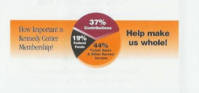
The back of the solicitation envelope that the Center mailed has a beautiful multicolor pie chart as an answer to the question: "How Important Is Kennedy Center Membership?"

So you look at the pie-chart to understand how important the "membership" is and guess what? NONE of the pie slices is labeled "Membership".
  • The 37% slice is labeled "Contributions"
  • The 19% slice is labeled "Federal Funds"
  • The 44% slice is labeled "Ticket Sales & Other Earned Income"
So where is the Membership? I guess it's "Contributions"? But if that is so, WHY MAKE ME THINK?

Why not just call it "Membership" so I can establish an immediate visual connection between the Question and the Answer?

But it's not over yet.

The pie-chart is followed by a call to action: "Help make us whole!"

Yes, BUT HOW? That's not clear either.

Here is the Other Cardinal Rule of direct mail envelope copy - If you are asking the reader to do something, you should also provide specific steps to complete the requested action.

From the pie, it's not clear which slice should I help EXPAND to make it the WHOLE?

Should I help the Kennedy Center become WHOLE by increasing their Federal Funds?

Should I help the Kennedy Center become WHOLE by increasing their Ticket Sales & Other Earned Income?

Or,

Should I help the Kennedy Center become WHOLE by increasing their Contributions?

I suspect the Center would like me do the third pie-chart alternative.

Then why don't they simply tell me "Send in your Contribution today!" ?

The lesson -- do not force your readers to solve puzzles. That will drop your response rate considerably.

2) IONA Senior Services

Their motto, printed right on the envelope, reads:

"Experts on Aging"

Like in "we are experts in helping you get older"?

Probably what they meant was this: "Experts in Elder Care..."

What a difference the right and wrong copy can make.

Tuesday, July 17, 2007

Copy That Creates Questions

Good copy should answer questions, not create them.

From an air filter commercial:

"Nine times better than the leading brand..."


Really?

If a product is NINE times better than the "leading brand," how come it trails behind? How come it's not the leading brand?

Either the consumers don't know what they're doing, or the copywriter...

Troubling questions that did not exist before the commercial.

Tuesday, July 10, 2007

Ambiguous Envelope Teaser

Envelope teasers are very crucial in direct mail since the prospective customer has about 3 or 5 seconds to decide whether to open your envelope or chuck it into the trash bin.

Here is a weak and rather annoying envelope teaser that would've directly gone to the trash basket if I weren't a professional copywriter who likes to meditate on these things and tries to learn something new everyday about this fascinating business of direct mail:

"Is This Little-Known Energy Company America's Next Major Uranium Producer?"

My first reaction is:

"You are asking ME? How the heck would I know? YOU are supposed to be the expert and yet you don't know whether THIS [whatever it is] little-known company is the next big thing on the horizon or not?"

As I read the envelope teaser I'm wondering if THIS is a way for me to make money OR provide free information to someone who doesn't quite has the skinny on this "little known company" yet...

Who knows, perhaps this "little known company" is little known for a very good reason indeed!

This teaser has already lost me with its indecisiveness.

Then comes the next line:

"Time-Sensitive Report. Open Immediately."

No. Sorry. I won't. Because who ever wrote the copy is not sure of this company at all. If the publisher is not sure of his/her facts, how can I trust him/her to lead me?

Why didn't this teaser really teased the heck out of me and did its job with no holds barred by saying something like:

"Little known company... about to explode (guaranteed!) as America's next major uranium producer. Limited-time opportunity to get in on the action before the little known company is not so anymore..."

Now, THAT would have perked my attention because of the firmness of the voice and the strength of the promise.

If you want me to open that envelope DO NOT ASK ME PUZZLES and DO NOT MAKE ME THINK.

If you are trying to write a teaser don't be halfhearted or shy about it. Make sure you are really TEASING instead of posing intellectual puzzles with no answers.

Sunday, July 8, 2007

No Copy is Better Than Lazy Copy

I have received this auto insurance offer by mail from a very well known wholesale merchandise company that reads:

"Save up to 20%..."

"As a XXXXX Member, you are now eligible for Money-Saving Auto Insurance RATES OF UP TO 20% OFF..."

My heart sank. Because XXXXX is a good company and they usually know what they are doing.

So how come they approved this lazy piece of copy that will not work for most of their prospective customers?

20% off OF WHAT for God's sake?

What is the base line here? What is our frame of reference?

How can the XXXXX officials know they are saving me "up to" 20% if they have no idea what my CURRENT rate is?

How do they know that their rate is not actually 20% MORE than what I have now?

What they are REALLY saying is "call us now and we will talk about it."

No sir, I will not call you now or later because your copy does not make sense and it also insults my intelligence. And if I were you I would hire a new copywriter right away.

If, however, they did quote a real person with real savings, then, who knows, I might've given them a shot.

A much better copy that read something like...

"THEY SAVED...

Our Member No. 123456 John Smith has saved 19.7% from his car insurance. And so did Jane Doe -- she couldn't believe it when we proved to her that she could save 18.5% over her existing rate.

How about YOU?

Wouldn't you like to find it out with a single toll-free phone call?"


Then I might very well have given them a call. But not like this.

When consumers are treated like idiots they recoil. The only ones who won't will probably be the ones in desperate credit or financial problem. But are those the kind of customers that big corporations are trying to attract? I don't think so.

Good customers deserve good copy.

That's why I think "no copy" is much better than lazy and unintelligent copy.

Why?

Because when you do not send out any tired old mail pieces like this, you at least do not create question marks about the quality of the decisions made within your company. Your profits might remain level but your reputation and brand image would be intact.

Tuesday, June 26, 2007

Headlines - One Hit, One Miss

Best headlines provide a link between the verb and the subject of the sentence. Try to come up with verbs that also define the subject in some important way.

In Object Oriented Programming (OOP) jargon, the "method" should be an "attribute" of the "object" itself.

For example, here is a great headline from Wall Street Journal (June 25, 2007):

"Gazprom Pipeline Plan May Fuel Worry."


"Fuel" is what flows from a pipeline and it also has a double meaning of "exacerbating."

But here is a miss from the same issue:

"Milk-Price Rise Expected to Steepen in July."

"Steepen" is not a verb intrinsically related to milk. But milk, when overheated, boils over in a froth.

So what about:

"Milk-Price Rise Expected to Froth Over in July"?

That would have been perfect in my judgment.