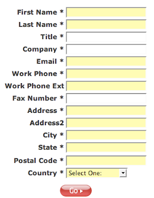
The rule is -- the more information you ask from your prospective customers upfront, the lower will be your conversion rate.
How many people do you think have signed up for this "Free software demo" by providing all the following MANDATORY information (all the fields with asterisks)?

What were they thinking?
You have to be really desperate for this software in order to provide all that MANDATORY information before allowed to watch the demo.
The kicker is, they won't tell you WHAT exactly their "service" is all about either. No. You have to give them all that information about yourself (including your FAX NUMBER) and THEN, and only then, they will allow you to have a peek at what they've got.
Good luck!
Rule of thumb: if you'd like to have a good conversion rate, ask no more than NAME and EMAIL address. That's it. Some people are so hungry for your e-mail that they even skip the name.
P.S. The cost of this service that you cannot even sample before giving up all that information is $5,000 upfront for "set up"; and then $300 recurring fee every month. So I guess they are interested only in people with really a lot of cash and a lot information to give up. I hope that strategy is working for them.


No comments:
Post a Comment