Monday, September 9, 2013

Which way your sentences are branching? Right or Left?

© Ugur Akinci

Try right-branching sentences in your writing for higher comprehension.

Right-branching sentences start with the SUBJECT, follow it with PRIMARY VERB (or sometimes the other way around if the verb is in imperative/order mode), and then end with modifiers and other relevant information. What branches off to the right of the subject and the verb is all the additional information you want to get across.

For example, here is a RIGHT-branching sentence:

"You need to access the control panel to rewire the card reader."

SUBJECT ("You") + PRIMARY VERB ("access") + the rest.

Here is the LEFT-branching equivalent of the same sentence:

"To rewire the control panel you need to access the control panel."

SECONDARY VERB ("rewire") + DIRECT OBJECT ("control panel") + the rest.

Which one you think is easier to understand and remember?
 
Here is another example of a RIGHT-branching sentence:

"Check the voltage before connecting the alarm module."

PRIMARY VERB ("check") + SUBJECT ("you" implicit in the imperative form of the verb "to check") + the rest.

And here is its LEFT-branching equivalent:

"Before you connect the alarm module check the voltage."

SUBJECT ("you") + SECONDARY VERB ("connect") + SECONDARY OBJECT ("alarm module") + the rest.

Right-branching sentences say the most important things upfront, right away. They are immediately satisfying and relaxing structures.

In contrast, there's a tension in left-branching sentences since the most important information is held off from the reader until the end of the sentence.

Friday, January 9, 2009

How to Skirt the Spam Filter

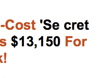
Some online marketers knowingly separate the letters of "spam trigger words" like CASH, SECRET, FREE, etc. in their marketing emails.

Here are 2 examples:


Some also spell "free" as "f*ree", "cash" as "c*ash" etc.

Pretty slick, eh?

Wednesday, January 7, 2009

From a Technical Writer in China

Susan Wu is a Chinese technical writer living and working in Shanghai. She keeps a very informative blog that I follow with great interest.

Here is what Susan has written lately about the "real situation" in China:

"With the recent economic crisis and financial meltdown, the impact is worldwide, not just in the U.S. From what I’ve been hearing all around, many companies in China are laying off workers, cutting back on salaries, not giving out bonuses this year, and/or not hiring. People who are out of work are having a difficult time finding a job. Many fear losing their job. Thousands of recent college graduates compete for a very limited number of jobs. Even graduate students are fighting for jobs like selling pork.

On the other hand, Wangjianshuo observes that what you hear is different from what you see. I also agree with him. When you go out, there are people everywhere. Restaurants are always packed and often times, you have to wait a long time to get a table. Shopping malls are also busy with many shoppers carrying bags of goods they just purchased. It’s still hard to find an empty taxi in downtown Shanghai.

I don’t really understand what is really happening either because news and media keep saying how bad the economic situation is in China and that we haven’t seen the worst yet. I can’t really tell judging from the way people are still spending. Unlike in the U.S. where people are cutting back, I see that people in Shanghai continue to spend like before. "

Perhaps the "sub-prime" and "Madoff" waves have not yet hit China in full force? WHo knows. I'll keep reading Susan's keen observations.

Friday, December 19, 2008

Simplicity is the Essence of "User Value"

Sometimes some gadgets are built so complex that it's hopeless. Take my microwave for example, with 20 buttons and a number pad.

All I need is TWO buttons and a number pad to enter the amount of minutes and seconds I need to heat up my food.

Here is what the manufacturer gave me:


And here is what I really would love to have:

Thursday, December 18, 2008

What the Heck is an “Effective Megapixel”?

There are a number of digital cameras marketed this year according to their “effective megapixels.”

So what the heck is an “Effective Megapixel”?

If you think it’s a marketing gimmick, it is, but not in the negative sense that one would expect.

Actually it’s a positive thing for which all digital camera manufacturers and marketers should be congratulated.

An “effective megapixel” is the actual number of pixels which make up the viewable image captured by a digital camera.

If for example a camera has 4.5 megapixels with 4.1 effective megapixels you can safely ignore the 4.5 part. 4.1 megapixels is what you’ll actually see in a photograph.

The difference between these two concepts is expressed beautifully by this food analogy published by digicamguides.com:

Total Megapixels: This is like the full plate of food.

Effective Megapixels: This is the amount that you eat.

And did you know that the number pixels is important only with relation to the ultimate PRINT SIZE?

That is, a 2.0 megapixel camera produces pictures as sharp as an 8.0 megapixel camera if you never print anything larger than 4” x 6”, which is the standard print size in the USA.

So, if you’ll never print anything larger than 8” x 10”, you’ll never need a camera with more than 4.0 megapixels.

But the camera manufacturers of course will never tell you that in order to keep selling more expensive cameras with even more megapixels. I don’t believe the human eye can even tell the difference beyond 4.0 megapixels.

Here is a Print Chart to help you decide what kind of a camera you might need:

Megapixels -- Print Size (inches)

2.0 -- 4 x 6 [standard]

3.0 -- 5 x 7

4.0 -- 8 x 10

5.0 -- 9 x 12

6.0 -- 11 x 14

8.0 -- 12 x 16

(Source: digicamguides.com)

Wednesday, December 17, 2008

Wealth of Indexing Options in OpenOffice

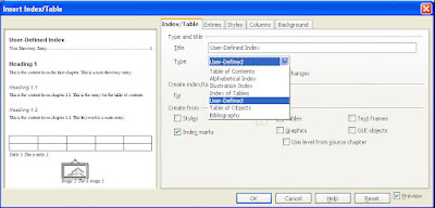
OpenOffice offers such a wealth of indexing options.

Select Insert > Indexes and Tables from the main menu to display the sub-menu.


Select Indexes and Tables once again to display the main screen where you decide what goes into your TOC or Index, and how the finished product should look:


By using this screen, you can create a regular Table of Contents, Alphabetical Index, Illustration Index, Index of Tables, User Defined Index, Table of Objects, and a Bibliography.

You can select up to 10 levels of indentation but in my experience anything over 3 levels becomes confusing and distracting.

Again, from my own technical writing experience, an Index of Illustrations/Figures and an Index of Tables come in very handy when your document includes dozens and even hundreds of tables and figures. Readers really appreciate that.

You can create an index for the entire document/book or just for one chapter:


I created many documents in the past with chapters running upwards of a hundred pages. For chapters like that it's always very useful to have a mini TOC just for that chapter alone. With OO, you can accomplish that easily.

Indexes are always created form markers. OO allows you to select from the following marker types in creating your index:


(P.S. OpenOffice is a FREE open-source application.)

Tuesday, December 16, 2008

Even Howie Could Not Help this Search Engine...

I like Howie Mandel a lot. I think he's a very hard-working and interesting guy (like he never touches anybody for fear of catching germs).

So when I saw this HM commercial on TV for Buy.Com I enjoyed the clip because Howie is such a sweet character.

And a day later, when I was shopping around for a bottle of perfume for my wife, I decided to check out Buy.Com. That's how commercials supposed to work, right?

But what a search engine Buy.Com has! Never seen anything like it.

Usually, when a search engine cannot find what you're looking for, it 'fesses up and flashes a message like "No search results were found -- please try again" etc. And then you try again.

No. Instead, Buy.Com flashed this really sophisticated-looking feedback:


Hmmm... that's interesting...

So I start clicking on these searches to "remove one or more words" from my search and ended up... with nothing.

Here are the pages I got after clicking the first, second and the third search results:


Obviously none of these results has anything to do with the perfume I was looking for.

So why did Buy.Com waste my time by having me click this and that only to send me to totally unrelated search pages? Why is need for the wild goose chase?

Here are some Rumsfeldian questions and self-provided answers:

Is this the last time I'll visit Buy.Com? -- Probably.

Can they improve their search engine? -- Yes. Just tell people "No search results found -- please try again" and they will.

Is there a lesson in this? -- Yes. LESS IS MORE.